ortigia: a sensory edit
Creative Direction · Travel Campaign Concept
Self initiated campaign concept exploring place through colour, texture, movement and sensory storytelling.
PROJECT
Ortigia: A Sensory Edit
FORMAT
Travel Campaign Concept/ Creative Direction Deck
ROLE
Creative Direction · Campaign Strategy · Visual Research
YEAR
2026
LOCATION
Ortigia, Sicily
Ortigia: A Sensory Edit is a self initiated travel campaign concept exploring how the destination could be communicated through atmosphere, contrast and sensory detail.
The project develops a visual direction around colour, food, architecture, movement and everyday street life, with a proposed content system spanning hero film, short form social edits and still imagery.
Creative Direction
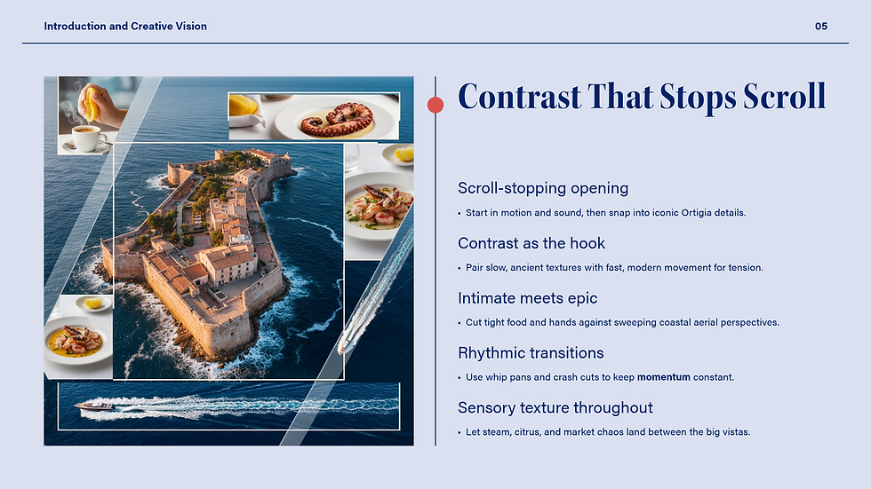
The visual direction was built around Ortigia’s contrasts: quiet streets and busy markets, faded stone and saturated colour, still architecture and constant movement.
Rather than presenting the destination through polished postcard imagery, the concept uses tighter details, unexpected transitions and sensory moments to create a campaign that feels lived in, immediate and visually distinctive.
Visual Language

Mood & Atmosphere
Warm Mediterranean light, high contrast and tactile detail create a polished but lived in travel aesthetic.

Palette & Style
Terracotta, deep ocean blue and crisp white connect architecture, coastline and sunlight across the campaign.

Dual Perspective
Intimate details are paired with wider coastal movement, allowing quiet sensory moments and high energy imagery to exist within the same visual world.

Food & Café Culture
Local ingredients, café rituals and close sensory details bring Ortigia’s everyday food culture into the campaign.
From Concept to Campaign
The full deck develops the visual direction into a complete campaign system, including movement, sound, production planning, audience engagement and launch strategy.